Health and wellness these two words influenced us to create an identity for a pharma company. The idea was to create a simple look that can easily convey the communication yet establish a strong presence. We chose blue and white as the colour scheme for a clean and classy look.

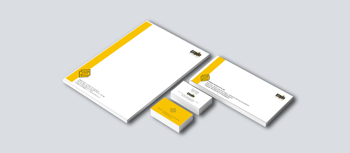
Rebranding for this furniture brand was a challenge as we had to re-establish its identity in the competitive market. This brand needed refreshment that can attract more consumers. So, we chose yellow for its lively and refreshing vibe. To keep in mind the brand’s character we played with the E. We have turned this simple character into a stylish pneumonic that has become the identity of the brand.


This stock market training institute needed a classy and distinctive feel around it. Simple yet strong branding with a touch of gold (the brand deals in stock market training, striking gold is a norm!) the distinct use of font gives a unique identity to this brand. The identity is carried forward in the brand communication as well.


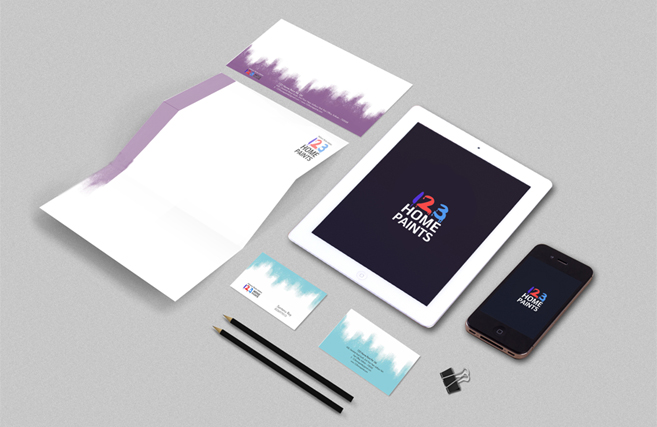
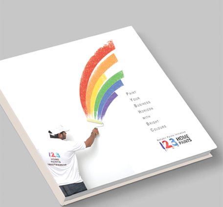
This home painting services company had a unique problem. They dealt with colours. They loved them all. When they painted your home, they loved yourwala shade of green ro red or blue or pink. They painted my wall and they loved my shades of grey. It was a challenge to create a brand colour for them. So we choose white as a base colour and any shade of any colour but maintaining a definite shape. Their letterhead had a shade of violet and their business card had a shade of turquoise. We accomplished a colourful yet very smart looking corporate identity.
The strong philosophy behind this brand helped us create its identity. Dealing with highly technical product, this brand needed a strong colour presence that also identified with the brand philosophy. The result turned out to be very striking.


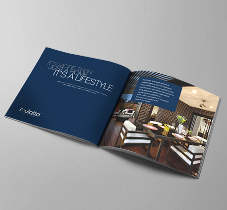
Identity created for an upmarket furniture brand that would bring together western classic designs with eastern ornate concepts. The simple logo with M is broken in two parts resembling the mix.
A financial services company needed an identity that highlights protection. The idea was created with pearl shell and the letter V embedded in it. The colour scheme Is a vibrant saffron to balance a peaceful white resembling growth and peace of mind.